Tone
A color-driven music discovery interface.
Interaction design, visual system,
interface prototyping
Mobile interface prototype
Color & music discovery
2026
Design prototype

The opportunity
Start with a feeling, before a genre.
Music discovery often begins with an artist, a genre, or an algorithmic suggestion. Tone explores a more sensory starting point: a color.
Tone is designed for listeners who want to explore music through mood and personal associations. A color slider leads into playlists, sharing, and a listening journal.
Core interaction
Color → playlist → listening journal.
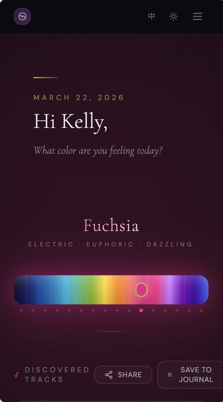
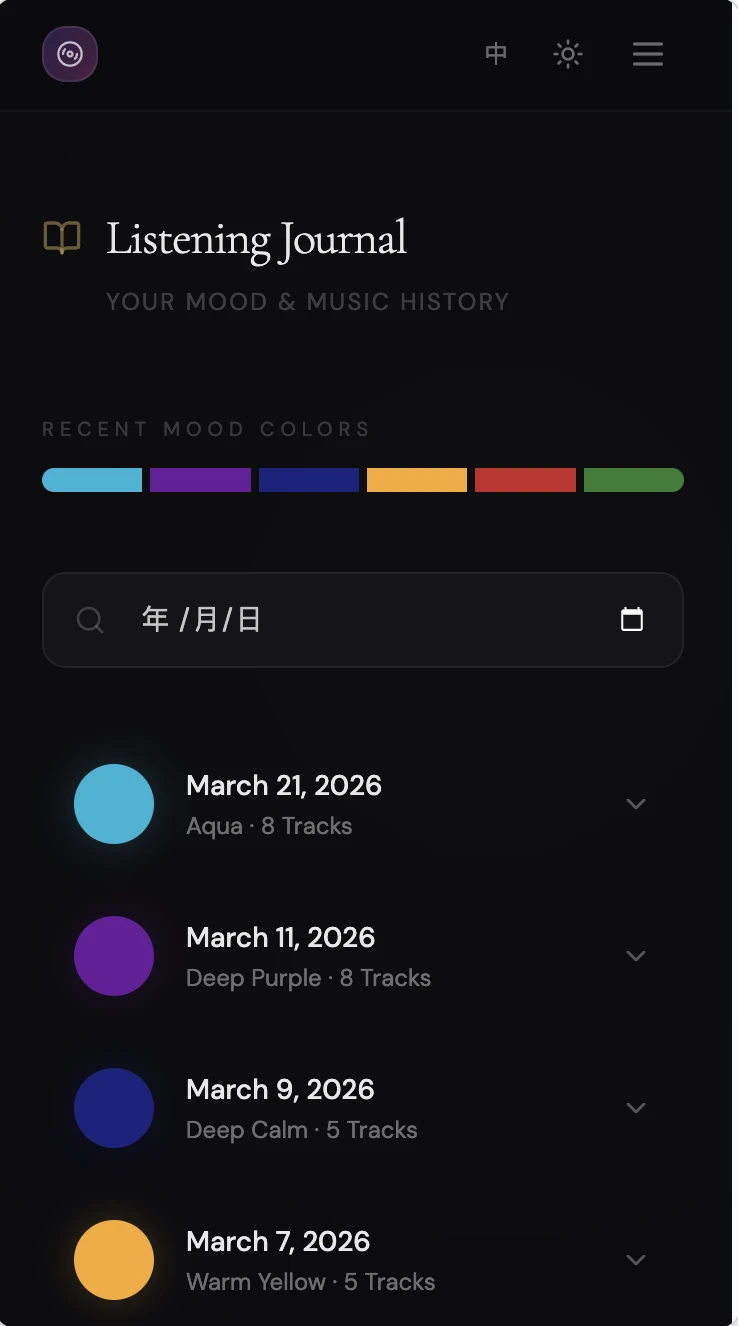
Select a color on the spectrum to see its name, mood description, and associated playlist. The journal organizes past selections by date. A sharing screen presents the playlist as a color-themed card.
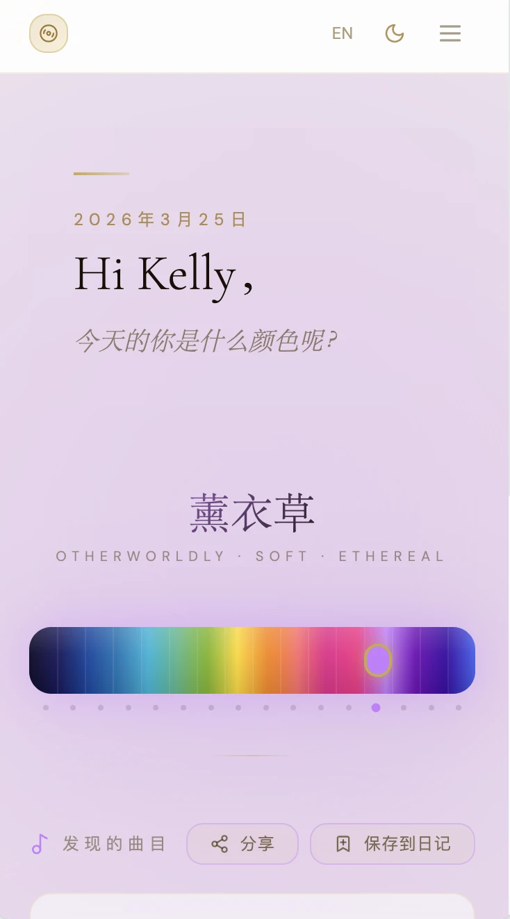
The prototype includes light and dark modes, along with English and Chinese interface options.
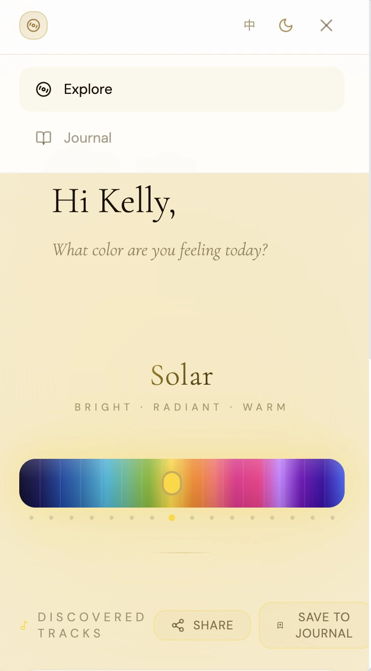
What color are you feeling today?
The slider lets listeners choose a color before browsing tracks. These screens show how that choice appears in different interface themes.
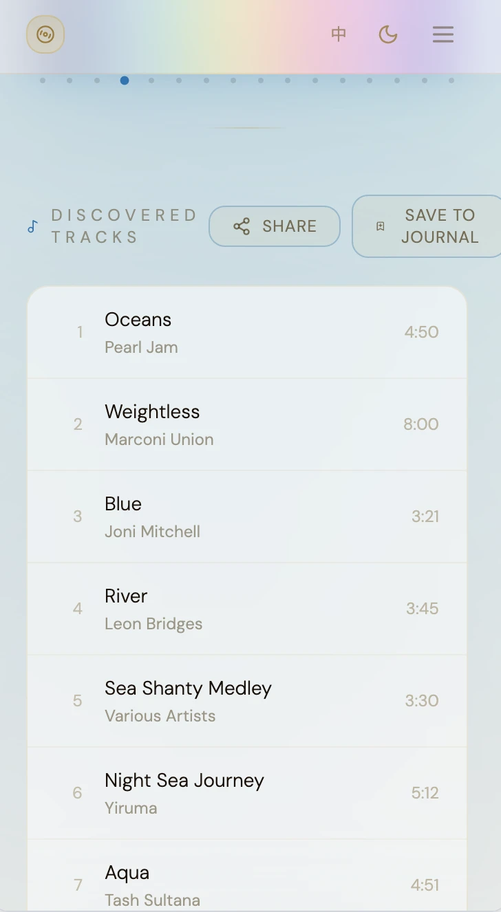
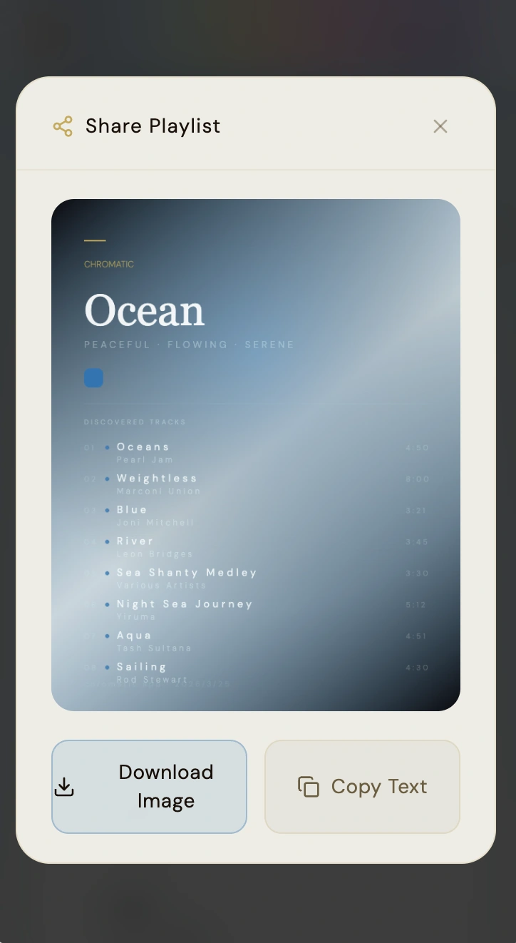
From color to playlist.
Each color selection leads to a playlist view. The sharing screen includes options to download its card as an image or copy the playlist text.
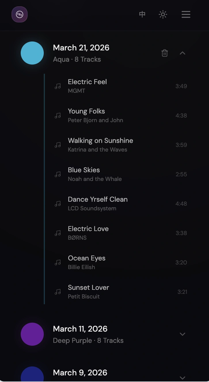
A journal you can see.
The listening journal groups selections by date and color. Opening an entry reveals the associated tracks.
Design decisions
One color across the flow.
A continuous spectrum. The slider makes color the main input, with short descriptions to help explain each selection.
Quiet typography. Large color names and restrained controls keep the selection and track list easy to read.
A visual memory. Dated color entries make past selections recognizable in the journal.
Reflection & next questions
A personal association, not a universal rule.
Tone explores an alternative to searching by artist or genre. The prototype shows a proposed color-to-playlist flow; it does not establish a universal relationship between color and musical taste.
Further testing should examine how listeners interpret the colors and whether the associated playlists match their expectations. The names and descriptions also need to work for people who perceive color differently.